A Graphic Designer creates the props and set-pieces for film productions and works directly with the Production Designer. Depending on the period and genre, these can be newspapers, love letters, shop signs, posters, cigarette boxes, logos. Basically, they create the original materials needed for a film that haven’t yet been invented.
I was fortunate enough to interview the extremely talented Graphic Designer Tina Charad. In the last 10 years she has worked on over 30 productions including the films “Robin Hood”, “Edge of Tomorrow”, “World War Z”, “Pirates of the Caribbean”, “The Fifth Wave”, and “RocknRolla”.
Matthew Toffolo: Is there a film or two that you’re most proud of?
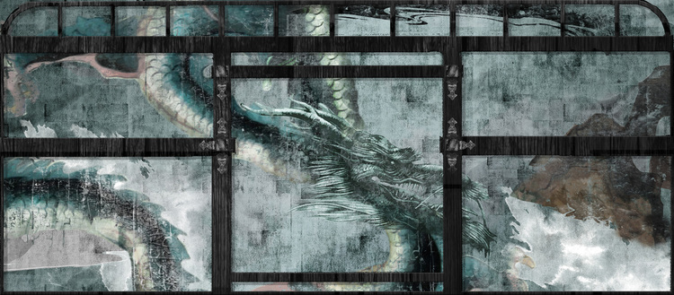
Tina: Well, in terms of pure indulgence, of being spoilt and designing beauty day after day, it would be 47 Ronin. Perhaps Maleficent too – for the same reasons.
Tina created images in the film “47 Ronin”:
Matthew: How long do you generally work on a film? How early do you come on in pre-production? Do you stay until the end of filming?
Tina: It really does depend. On the whole, a large studio film in the UK could be 9/10 months work. The prep time is longer as is the shooting schedule. I have worked both in the UK, where I started and the US, where I now live. In the UK the Graphic Designer is really responsible for a large amount more work than the US. That may sound bizarre in terms of the work load varying but in the US there are a lot more print houses and production places that can facilitate some of the graphic design parts where as in the UK, the Graphic Designer creates all the Art department, set dec & prop pieces – no matter how big or small.
Matthew: What’s the difference when working on different genres? From a straight up drama like “Body of Lies”, to a pure fantasy like “Maleficent”?
Tina: Well there is a huge difference. With something like BOL, you’re not creating fantasy. Often you are recreating reality but in a different location. So you’re making mobile phone stores, embassy clinics, roads signage. They are a huge part of what makes the film real, but not wildly creative. You have to be on the nose accurate, especially when working in foreign languages and alphabet like that film. We shot in Morocco, but were predominantly set in Jordan. The Arabic is different in these two countries. I had to have a translator who knew the differences. I then had to set about researching contemporary Arabic branding and identities as you would in the US. I had to create large scale banks and corporations but in Arabic. I spent a lot of money purchasing good contemporary Arabic fonts.
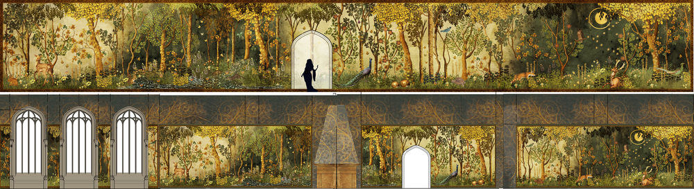
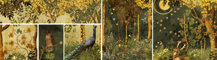
With Maleficent, I was re-united with a favorite designer. He wanted me to create a large scale tapestry for Sleeping Beauty’s bedroom. Whilst there were suggestions of medieval tapestries etc thrown in, he was very clear that he wanted to design something original. Also he pointed out that we were not a historical film, but a fantasy and the tapestry should show that. I think the brief was “Grayson Perry Meets Flemish”. So I worked on a fantastical forest scape that was a day and night scene. It has a wealth of lovely references and feels both fresh and stylistically fitted the brief.
Tina created the Sleeping Beauty bedroom images in “Maleficent”
Matthew: What about your experiences working on “American Ultra” or “The Crazy Ones” TV show? Is a straight up comedy an entirely different experience? Is your creative process all about making people laugh?
Tina: Well to be fair, In American Ultra I was doing reshoots especially of all the insert work. The producers and director found that the stuff didn’t work once they had shot it. For many reasons it had to all be recreated so it wasn’t really humorous at that point. You are just trying to get all these pieces and stick them together. In fact I didn’t get the script for that so I had no idea it was a comedy. It all seemed like a typical spy caper to me at the time.
I did a little on The Crazy Ones as they wanted to elevate the look and feel of the show. I had also worked at Leo Burnett where the show was supposedly based on. Despite what the designer hoped for, there is still only so much you can do with a comedy show – the jokes have to be pretty brash and in your face. No room for subtlety. It’s not my best genre – TV comedy. I find myself always fighting for the more subtle joke, and losing…
Matthew: What is the most challenging aspect of being a graphic designer?
Tina: Going to have to be clearances & the legal side.
Matthew: I have to ask you about the “Fifty Shades of Grey”
experience?
Tina: One of the most anticipated films of 2015. Were your design themes all about power and sex?
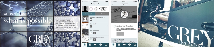
I started with David Wasco before any other art department. Initially we worked on researching the sex furniture for the red room of pain. David knows that I can do illustrative work so I looked at initial pieces of what these key pieces of furniture would look like. I have worked for a lot of designers sourcing reference and style imagery so we looked at humanizing the story. The book is pretty 2 dimensional as are the characters, so between Sam the director and David, they wanted to add life into it. In terms of the graphics in that film, trying to design a logo that doesn’t look like a film graphic and that could carry through 3 films and maybe 5 years without looking dated or getting changed, was a challenge. But I did several passes at first and Sam knew straight away which to choose. That initial Grey Enterprises logo is what Universal based their entire marketing campaign on. The other key logo was SIP – Seattle Publishing which actually didn’t make it into the film but is a key part of book2. I bet they use a new logo but that would be a huge pity. I rather liked my SIP work!
Tina’s created logos for “Fifty Shades of Grey”:
Matthew: You worked as a Graphic Designer on the David Fincher directed music video “Justin Timberlake Ft. Jay-Z: Suit & Tie”. How long did you work on the video, what did you do, and how was working with so many iconic people?
Tina: Good Question! I watched the video again to remind myself. Well that and sifted through my back up folders. I remembered doing a lot of etched mirror and glass for that video and sets. I remember there was a nightclub that was branded (signage, props etc) and had an old rat pack feel. What one has to remember is what is in the final edit does not show what was made. We prepare for what is initially discussed but things can change on the shoot day, the director or cast and request changes and then a whole scene can be cut. David Fincher is very particular about everything so the designer had all sets covered from an art direction, graphics and prop side. Better safe than sorry.
Matthew: Do you have a Production Designer or Graphic Designer mentor?
Tina: No – not really;
I spent 10 years in the real world of branding & advertising before moving into film. I loved Fabien Baron -you might guess from the fifty shades ;). So I didn’t really need mentoring when it came to graphics in the film industry with a designer so to speak, as I already had the skills. I have a couple designers I would work for regardless of pay or the job (let’s hope they don’t read this) they are David Wasco & Gary Freeman. Love the projects David chooses, they are often smaller and more interesting pieces. He is a designer that graphics are hugely important too. Gary uses me more as a Graphic illustrator on large scale pieces. Installations that normally are dreams briefs.
Matthew: What movie, besides the ones you’ve work on, have you seen the most in your life?
Tina: Another great question. There isn’t 1 but 3.
Gladiator – no explanation needed
Team America – I will never stop laughing or being furious I didn’t work on it
Love Actually – it’s on every Christmas
Matthew: You’ve worked as a Production Designer on more than a few short films. Is that a position that you aspire to hold in the Hollywood feature film world? Is there a place where we can watch your short films?
Tina: I have done that. I’ve also worked quite extensively as a stylist and assistant set decorator which is something I did pursue for a while I never wanted to design. All my design jobs have honestly been decorating jobs. Then I moved to the US and had to choose between 44 or 800 and I decided to focus only on graphics. I have no idea if you can watch these shorts. I’ll have to investigate…..
Matthew: What Production Designer and/or Director would you love to work with that you haven’t worked with yet?
Tina: That would be KK Barrett for Production Design and Tim Burton.
Matthew: You’re working on the new Bourne Identity sequel. Can you give us a sneak peek to what to expect?
Tina: No! Haha
For more information on Tina, please go to her website: http://www.tinacharad.com/
_____
Interviewer Matthew Toffolo is currently the CEO of the WILDsound FEEDBACK Film & Writing Festival. The festival that showcases 10-20 screenplay and story readings performed by professional actors every month. And the FEEDBACK Monthly Fesival held in downtown Toronto on the last Thursday of every single month. Go to www.wildsound.ca for more information and to submit your work to the festival.


Reblogged this on Festival Reviews.
LikeLike
Reblogged this on WILDsound Writing and Film Festival Review.
LikeLike
Another insightful interview. Thanks for sharing.
LikeLike
Reblogged this on Festival for Drama in Film, Screenplays, Novels.
LikeLike
Reblogged this on Fantasy/Sci-Fi FILM & WRITING FESTIVAL.
LikeLike
Reblogged this on Crime/Mystery Film & Writing Festival.
LikeLike
Reblogged this on Thriller/Suspense Film and Writing Festival.
LikeLike
Reblogged this on TV Screenplay Festival. Submit Today..
LikeLike
Reblogged this on Action/Adventure Film & Screenplay Festival.
LikeLike
Reblogged this on POETRY FESTIVAL. Submit to site for FREE. Submit for actor performance. Submit poem to be made into film. .
LikeLike
Reblogged this on First Scene Screenplay Festival.
LikeLike
Reblogged this on WILDsound Writing and Film Festival Review.
LikeLike
Reblogged this on FEEDBACK Animation Film & Screenplay Festival.
LikeLike
Reblogged this on WILDsound Writing and Film Festival Review.
LikeLike
Reblogged this on WILDsound Writing and Film Festival Review.
LikeLike
Reblogged this on WILDsound Writing and Film Festival Review.
LikeLike
Reblogged this on WILDsound Writing and Film Festival Review.
LikeLike
Reblogged this on WILDsound Writing and Film Festival Review.
LikeLike
Reblogged this on WILDsound Writing and Film Festival Review.
LikeLike